Climbing One Mountain After Another: The Story of Kathleen Gemberling-Adkison

By Olivia Jacobsen, Class of 2028

It’s commonly understood that there’s no correct response to death, no correct way to grieve. After experiencing great loss, people behave in a vast array of sometimes peculiar ways. As Joan Didion wrote in her 2005 memoir The Year of Magical Thinking, “The power of grief to derange the mind has in fact been exhaustively noted.” That said, most people wouldn’t hike to the Mount Everest base camp for the first time, at the age of 68, almost directly after the death of their husband. Then again, Kathleen Gemberling-Adkison was not like most people.

Kathleen Gemberling Adkison at Mount Everest Base Camp, 1993 (photo: Jean Kendall)

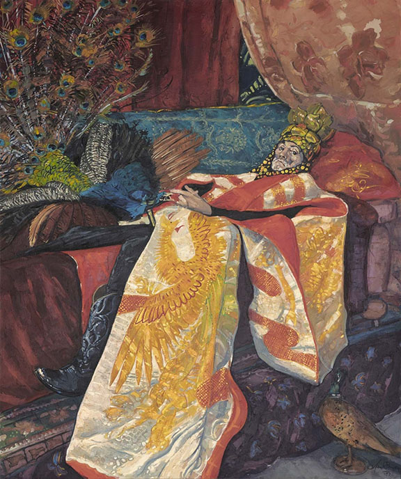
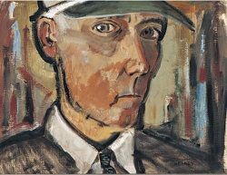
Born Kathleen Parks in Beatrice, Nebraska, in 1917, Katahleen would go on to become a well-known Pacific Northwest landscape painter. During the Great Depression, the Parks family moved to Seattle, Washington, where, in Kathleen’s final year of high school, she first received formal art instruction. But it wasn’t until she was mentored by renowned abstract expressionist, Mark Tobey, that she began to develop her distinct style. In a time when female artists were discouraged from painting anything other than portraits and genre paintings, Tobey’s instruction was highly subversive, as he never gave assignments and always encouraged his students to paint what they found interesting. “Before that class, I felt guilty for painting,” Gemberling-Adkison remembered, “I’d been punished in school for drawing, and made to feel that it was something I should try to ‘get over.’ He [Tobey] made me realize that painting was of some worth.”

In 1950, Kathleen moved to Spokane, Washington, where, removed from Tobey’s guidance, she spent time acquainting herself with the area’s natural landscape, later explaining that she enjoyed painting natural landscapes because she liked exploring the mysterious and unexamined places in nature and hoped for her paintings to be “something a person could meditate on” and for them to have elements “that couldn’t be seen at the first viewing.” It wasn’t ever just about the landscape, however. She viewed her landscape work as a metaphor for the layered complexities of human relationships more broadly, stating that “The closer you look, the richer people seem.”

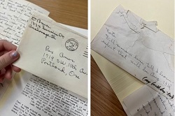
Gemberling-Adkison was married three times. Not much is known about her early marriages aside from the understanding that, if given an ultimatum, Kathleen would invariably choose being a painter over being with a man. In an interview, she stated: “After my first marriage broke up, a psychiatrist told me if I’d just quit painting, my marriage would be OK. I never went back to him.”

Naturally, Kathleen wanted a spouse who would encourage her desire to create, not repress it, and, in 1968, she married Tom Adkison, a prominent Spokane-area architect. She and Tom would go on to travel the world together, visiting Europe and Asia, oftentimes hiking extensively and giving Kathleen inspiration for her paintings. Tom’s companionship indicates his support of Kathleen’s artistic endeavors, but it went further than travel and spending time in nature together, as he participated in shaping the work itself. In a 1978 interview, for instance, Kathleen gave Tom credit for naming all of her pieces. “I like titles, but I don’t name them and can’t think of any titles,” she said. “My husband thinks of all the titles.”

Everest

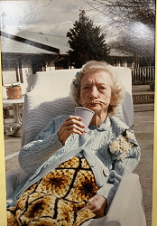
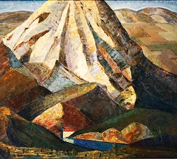
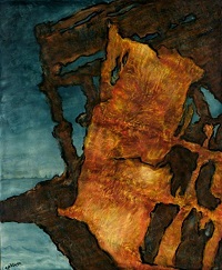
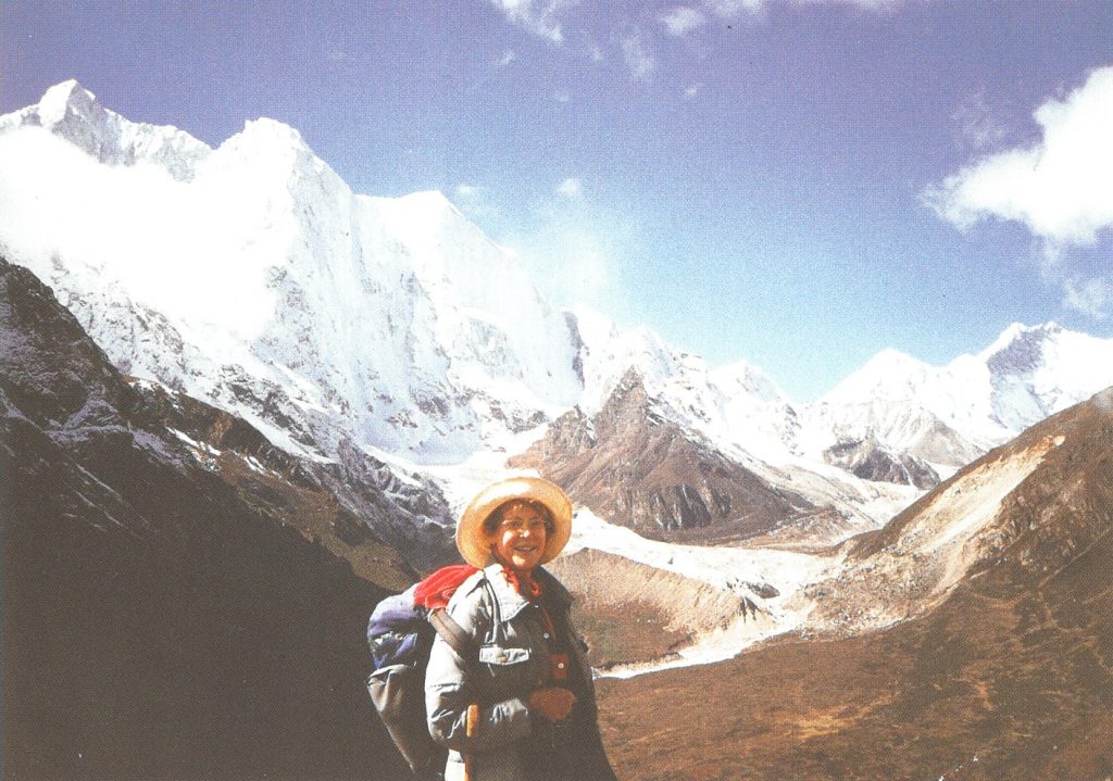
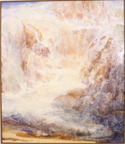
It is impossible to know what emotions Gemberling-Adkison was experiencing when Tom died in March of 1986, but, shortly after his death, she hiked to the base camp at Mount Everest with her friend Jean Kendall. After so many hikes in other countries with Tom, it’s difficult not to see this hike as a way of feeling connected to him after his death. Indeed, in April of 1986, Kathleen painted Everest. It’s difficult to conceptualize the vastness of the world’s tallest mountain, just as it’s impossible to fathom the death of a spouse, and Gemberling-Adkison captures this struggle in Everest. As with any colossal form encountered at close range, the painting has no distinct lines or shapes, emphasizing above all the inability to see, let alone understand, something so tremendous.

Base Camp

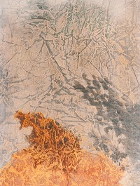
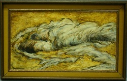
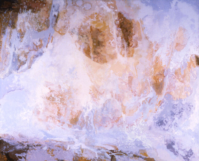
This inability to capture and decipher the whole picture can also be found in the undated work Base Camp. Depicting the conditions at Everest, the bright white colors work in tandem with warmer light pinks and yellows to create a very airy feeling, but it’s more than that. It’s an image that captures the camp’s beauty, but also a feeling of transcendence in the literal sense—not just of being at very high altitude, but of being enveloped in a cloud-like, heavenly state. This is a feeling, perhaps, that follows accomplishing a great feat in the face of hardship. Nor would Kathleen be willing to let that feeling go. Indeed, in 1993, at the age of 76, she completed the hike for the second time, again with her friend Kendall, proving once more that she was nothing if not stoutly determined to defy any and all conventions in her art, in her marriages, and in her grief.

Sources:

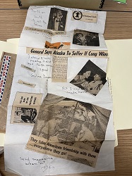
Didion, Joan. The Year of Magical Thinking. New York, Alfred A. Knopf, 2005. p.134 Newspaper clippings, 1980-1989, Series I, Box 1, Folder: 4. The Kathleen Gemberling Adkison

papers, WUA053. Willamette University Archives and Special collections.

Newspaper clippings, 1990-1999, Series I, Box 1, Folder: 5. The Kathleen Gemberling Adkison papers, WUA053. Willamette University Archives and Special collections.

Newspaper clippings, undated, Series I, Box 1, Folder: 6. The Kathleen Gemberling Adkison papers, WUA053. Willamette University Archives and Special collections.

Adkison interview, 1978 October 6, Series I, Box 1, Folder: 9. The Kathleen Gemberling Adkison papers, WUA053. Willamette University Archives and Special collections.

Adkison, Kathleen Gemberling. Adkison at Everest Base Camp. Photograph. Exhibitions, 1970
1999, Series I, Box 1, Folder 8. Kathleen Gemberling Adkison Papers (WUA053). Willamette University Archives and Special Collections.

Kathleen Gemberling Adkison Artworks, 1917-2010, OWS_WUA053_Adkison_art, https://digitalcollections.willamette.edu/collections/a4228fc3-ccaa-4132-b06f-28117b369 005


The Life and Death in Henk Pander’s Portraits

By Savanah Anderson, Class of 2028

“There is something fatal about a portrait. It has a life of its own,” writes Oscar Wilde in The Picture of Dorian Grey.1 Consider, for instance, the Mona Lisa. What can you tell me about that woman and her famous smile? Probably very little. In this way, it seems, the creation of a portrait is both a birth and a death; the original model replaced by a reproduction of themselves. This is the dilemma at the center of portraiture. How can an artist pick through the contents of a life like junk at a garage sale and decide how the subject will be remembered? This question is likely one intimately familiar to Henk Pander.

Pander, a Portland-based painter from the Netherlands, was primarily known for his Pacific Northwest landscapes and poster art, but it is his portraits I am concerned with.

Pander produced several portraits in his career, the most notable of which are Portrait of Delores and Prayer Before the Night. These paintings show in Pander’s body of work a unique fascination with death, so much so it might as well have been holding the brush. Both paintings are of figures nearing the ends of their lives, and it is through them and with the help of written archival information that we can begin to understand this strange pattern and how an artist like Henk Pander chooses to memorialize those closest to him.

Spurned by the negative reaction to his exhibition at Portland State University, Pander retreated from the art world to work at the Storefront Theater in Portland. There, he would work closely with director and costume designer Ric Young. In his own words, the two “began a long and creative friendship, which lasted until he died in the winter of 1992.”2 Perhaps, they felt a certain kinship, each being highly criticized artists and Ric being described as “vehemently opposed to any form of censorship.3 An ironically Wilde-esque figure, Young was an eccentric, ostentatious, and avant-garde artist. By all (admittedly limited) accounts, Ric was loved and admired within the theater community and, although often disliked by critics, he was certainly a topic of discussion for many of them. All things considered, he seems a man worth writing about, and maybe for a time he was, yet little information about him remains online.

“Prayer Before the Night”, Henk Pander, 1992

What remains, however, is Prayer Before the Night. This painting, now kept in the Frye Art Museum in Seattle, shows Ric Young as he lay dying due to complications of AIDS. Although perhaps not the same lively man he used to be, this portrait is an homage to the life and legacy of a man not to be forgotten. He lay surrounded by colorful, ornate fabrics, his frail figure swallowed by a large, draped kimono. A peacock, commonly used as a symbol for beauty and extravagance, sits on the bed beside him. He wears edgy black cowboy boots and a large, gold crown. As Henk would write in a piece on Ric, “he became famous for his great head pieces”4 which he designed for the Storefront Theater.

This painting immortalizes a man, not who he was soon to become, but how he was and is remembered by those who knew and loved him. It tells us little about his illness, his family, or his body of work, and instead creates an image of beauty and extravagance—of a richness of life.

Portrait of Delores tells a very similar story. Pander married his second wife, Delores Rooney in 1978. Generally, following a line of curiosity and conventional essay structures, now would be when I tell you about Delores, and I wish that I could. Yet, little about Delores is known to the public. One obituary claims she took an “extraordinary supporting role”6 in her career. A biography, (on Henk, of course), says her “support…allowed him to focus on his paintings”7 Her life before her marriage to the artist is seemingly lost to time. She was a shadow in the legacy of her husband’s work. Or, that would be the case, if not for her portrait.

Portrait of Delores is a portrait of strength. Her posture is relaxed, yet her expression is stern and unrelenting. She holds a large book on her lap, an homage to her work in the literary field, and a colorful ceramic vase sits on the table beside her. She wears bright red Wizard-of-Oz-esque shoes, matching the elegant red of the drapes behind her. She is dignified and unafraid. Delores would be diagnosed with cancer in 2010, which would take her life shortly after. Henk kept a journal documenting the process of her treatments until she passed, now kept in the Hatfield Archives, which details the agonizing experience of the decline of her health. She became thin and haggard, dwarfed by her hospital bed, her bones showing through her skin like the wings of a bat. This painting does not show this time in her life, but who she was in spite of it. As Henk would say in his journal, “she has been strong, fearless, independent, dignified, and sad throughout the ordeal,” and although she was hard to recognize, “she is very much the same person”.8

“Portrait of Delores,” Henk Pander, 2009 9

A painting will never be able to hold a life within its frame. We will never know Ric or Delores as Henk did and their portraits cannot laugh and speak as they did. And yet their portraits outlive them, and the talent of Henk Pander cements the image of these figures, not as they died but as they lived, in our minds and history, impervious to the weather of time. Each of these paintings hold fragments of what can be found in archives, after hours of concentrated digging—a love of fashion or literature, a sense of strength, their family’s talents—condensed into a singular representation. And whether in a museum or a collection online, they exist for all to see and remember.


1 Oscar Wilde, The Picture of Dorian Gray (Sterling Publishing Company, Incorporated, 2020), p. 116.

2 “Ric Young, 1974, 1989–1992,” Series I, Box 5, Folder 12, Henk Pander Papers, WUA064, Willamette University Archives and Special Collections.

3 Ibid.

4 Ibid.

5 Henk Pander Catalogue of Artworks, 1991-2000, Willamette University Archives

6 Martha Ullman West, “Delores Pander, 1938–2010,” Art Scatter, June 25, 2010. Accessed October 22, 2025.

7 Roger Hull, “Henk Pander (1937–2023),” Oregon Encyclopedia, April 24, 2024. Accessed October 22, 2025.

8 The Delores Journal, January–June 2010, Series III, Box 12, Folder 11, Henk Pander Papers, WUA064, Willamette University Archives and Special Collections.

9 Henk Pander Catalogue of Artworks, 2001-2012, Willamette University Archives


Psychedelic Pop Art and Pliés

By: Sarah Samala, ‘28

When you think of ballet, what comes to your mind? For most, it’s pink tights, pale tutus and classical music. However, when I was going through the materials donated by visual artist Tom Cramer in the Pacific Northwest Artists Archive, I came across the bright, almost psychedelic backdrops and hand-painted costumes of Oregon Ballet Theatre’s Jungle. Seeing Cramer’s strange, pop-art-esque art that typically covered cars or carved wood totems adorn the bodies and stage of the Oregon Ballet Theatre brought to mind several questions. Why was Tom Cramer chosen to set and costume a ballet? What was Jungle about? And finally, how did Cramer’s sets play into its narrative? Through research and the wealth of papers in the Willamette University Archives, I discovered the history of Jungle, and why Tom Cramer’s art was essential to its role within the modern dance world.

Jungle dancers stand in a line in front of Cramer’s set (TomCramerArt).

Tom Cramer was born in 1960 in Portland Oregon. He earned his BFA at the Museum Art School, now known as the Pacific Northwest College of Art in 1982. Cramer often combined different cultural mediums in his art. His early work, which consisted of abstract art and hand-carved totems, took inspiration from a variety of techniques like traditional Native American wood-carving and German expressionism. Cramer’s bright and chaotic style even made it onto unconventional canvases, as evidenced by his painted Volkswagens. Tom Cramer’s art was loud and memorable, yet described as eerily dark and foreboding by many. It was these qualities that caught the eye of dance agent Alex Dubay, who reached out to the Oregon Ballet Theatre’s artistic director, James Canfield, and pushed the visual artist into the world of ballet and theatre.

The Oregon Ballet Theatre first featured Cramer’s work in the 1994/95 season, where his first ever ballet set debuted in the American Choreographer’s showcase. The showcase was a culmination of several young choreographer’s original works, meant to challenge choreographers and dancers alike through its experimental nature. Shortly after being imbursed for this initial commission, Canfield sought out Cramer for another piece, one that would become one of Canfield’s most well-known works.

Tom Cramer and the set for the Fifth American Choreographer’s Showcase (Box 3, Folder 2).

The 1996/97 season’s “James Canfield Signatures,” featured Jungle, a fast-paced piece meant to capture the violence and majesty of animal life. Unlike most productions, Jungle’s set, which was a thirty-by-sixty-feet mural that channeled the essence of nature in Cramer’s style, was actually created before the choreography. This unconventional choice challenged choreographers to mold their work around the energy of Cramer’s art, making it the foundation of the entire piece. The music used within Jungle was also an unusual choice; forms I, II, III and IV from Future Sound of London’s Lifeforms, uses ambient electronic sounds to mimic the bird and insect sounds of nature rather than carry the audience to a dramatic or climatic ending. The costumes reflect this unorthodox theme as well, instead of tailoring costumes to each dancer, Cramer painted a large piece of nylon in his colorful abstract style that was cut and sewn into the dancer’s outfits, meaning each costume carried a piece of the larger artwork. Some costumes were even painted directly onto the bodysuits while they were on the dancers.

Tom Cramer paints a large strip of nylon that will be cut and sewn into Jungle’s costumes (Box
3, Folder 2).

Aside from the American Choreographer’s Showcase, Jungle and its accompanying James Canfield Signatures were a modern first for the company, which typically produced traditional shows such as The Nutcracker and Romeo and Juliet. Similar to Cramer’s innovative method of combining different mediums, artistic director Canfield wanted Jungle to change the expectations of a “standard” ballet by merging the traditional art form with unconventional practices and abstract art. Throughout his work in the Oregon Ballet Theatre, Canfield strived to “carry ballet from one century to the next” (Box 2, Folder 2) and elevate the older artform for growing modern audiences. Cramer’s unique art served as the backbone for Canfield’s goal, and the contemporary Jungle became an important fixture within the Oregon Ballet Theatre’s history.

After its run in 1997, Jungle went on to fulfill its show’s title and become a James Canfield Signature, eventually being revived in 2002 as one of James Canfield’s final pieces before he left the company. Even today, Oregon Ballet theatre continues to stylize their performances. In the 24/25 season’s Hansel and Gretel, an eerie silent-film aesthetic was combined with gaudy and colorful sets, creating a sense of unease and like with Jungle, causing the production to visually stand out. Cramer went on to paint one more ballet set for Ballet Pacifica’s As is Us, which makes both his work at the Oregon Ballet Theatre and Ballet Pacifica nearly one of a kind. Though Cramer’s art strays toward wood reliefs more than painted murals nowadays, the production still stands as a crucial part of his legacy, and an important milestone in the modernization of the Oregon Ballet Theatre’s shows.

Works Cited


Cramer, Tom. Jungle 1997. Tom Cramer Art. https://www.tomcramerart.com/pages/jungle1.htm
Future Sound of London. Lifeforms, Virgin Records, 1994. Youtube,https://youtu.be/nhOXE4wn6Sk?si=X1oLslwk1oHe3EZ9.
Newspaper articles about art, 1986-2012, Subseries B, Box: 3, Folder: 3. Tom Cramer papers,
WUA122. Willamette University Archives and Special Collections.
Newspaper clippings (and exhibit fliers and correspondence to Betty Perkins (mother) and
Francesca Stevenson), circa 1979-2011, Subseries B, Box: 3, Folder: 2. Tom Cramer
papers, WUA122. Willamette University Archives and Special Collections.
Oregon Ballet Theatre booklets and fliers (season schedules), 1994-1997, Subseries A, Box: 2,
Folder: 10. Tom Cramer papers, WUA122. Willamette University Archives and Special
Collections.
Oregon Ballet Theatre. Oregon Ballet Theatre, https://www.obt.org/. Accessed 9 Mar. 2025.
Oregon Ballet Theatre “Spring Romance” (article about Tom Cramer), 1995 March 9 – March 12,
Subseries B, Box: 4, Folder: 5. Tom Cramer papers, WUA122. Willamette University
Archives and Special Collections.
Portfolio and resume, circa 2005-2009, Subseries D, Box: 3, Folder: 14. Tom Cramer papers,
WUA122. Willamette University Archives and Special Collections.


Introducing WUpedia

Did you know?

  • How the Bearcat became the mascot of Willamette University?
  • Which WU president lost his contract renewal due to tobacco use?
  • That the Quad was once an athletic field, and the theater building used to be a gymnasium?
  • A Freshman class challenge in 1909 sparked an annual Glee competition that lasted nearly 90 years?

WU Archives is excited to announce the launch of WUpedia, an online encyclopedia dedicated to exploring the people, organizations, places, events, and history of Willamette University. The site showcases student-written entries, with fresh content added each semester. Stay tuned as we continue to grow this resource, preserving and sharing fun stories, fascinating people, memorable events, and quirky campus history!


An Artist in the Last Frontier: Dorathy Bruce Farr’s Missing Months in Alaska

Maggie Nevala ’26

Damage to Anchorage’s downtown after the 1964 earthquake

     Alaska is a state that is constantly on the brink. Earthquakes are a daily occurrence, barely warranting rousing awake, the 7.1 quake of 2018 only closing school for a week before students returned to classrooms with cracks in the walls. But in 1964, the 9.2 Great Alaskan earthquake thoroughly upended the growing city of Anchorage. The homes and infrastructure that were largely unequipped for such a disaster were destroyed, the death toll rising as the state experienced the aftershocks and effects that would continue for years to come. When Dorathy Bruce Farr arrived in Anchorage in 1965, the city was still rebuilding—and so was she.
     Almost the entirety of the information that remains about Dorathy Bruce Farr can fit in one box, the papers enclosed largely consisting of the countless letters she sent to peers and the copious notes of the reporter who worked to find Dorathy after her location became unknown to her friends in the 1980s.

One of the few available photos of Dorathy Bruce Farr, taken after she was found in a care center in 1985

These pen markings and scribblings make up all that is known about Dorathy’s life, certain buzzwords sticking out among them all and illustrating her origins. She was born in Portland in 1904, married her first husband at 18 and had a son, and then married fellow artist Fred Farr in the 1930s. She and Fred moved to New York together, where they hobnobbed with other artists, he was commissioned to make murals, and she studied her craft and made a name for herself as a batik painter. It is after this period that the details get murky. There is nothing said about what happened to Dorathy’s relationship with Fred, but she returned to Portland alone, continuing to exhibit her work there but making a meager living from it. The ‘60s were a blur of art, parties, and internal struggles that ended in her last show in 1970.
     Dorathy Bruce Farr is a woman of many mysteries, from her gradual mental decline due to what was most likely Alzheimer’s, the ambiguous death of her son, and the severance of any communication with her friends from 1980 to 1985, when she was found in a care center.

The front and back of one of the envelopes used to enclose the letters Dorathy Bruce Farr wrote to Rex Amos from Anchorage (Box: 1, Folder 3)

In all the many accounts of Dorathy’s adventures—or the attempts to piece them together—there is one that appears as a lone sentence, as an afterthought of an addition to a list of details about her: “Alaska ‘65 = work fish cannery” (Box: 1, Folder: 19) , or “She worked half a year in an Alaska salmon cannery” (Box: 1, Folder: 22). These are small descriptors used for a larger-than-life place, a place that should not slip through the cracks so easily. Even knowing her financial motivations for the trip—Dorathy was hoping to kick start her career by earning enough money to go back to New York—the lack of further details begs for there to be more to discover about Dorathy’s short and mysterious time spent in the Last Frontier, and a mere four letters written by her bear the burden of telling us the tale.
     Each of the four letters—written to fellow artist Rex Amos in July and August 1965—provide a unique insight into Dorathy’s observations and thoughts about the state. In the first of the letters, she expounds on the imagery of the city with the appraising eye only a seasoned painter could have. She creates a contrast between the beautiful nature surrounding her—“the mountains are purple, black, and sapphire and the sun is shining down the valleys” (Box: 1, Folder: 1)—with what she sees as the disruptive expansion of the cityscape. Her poetic musings are interrupted by the telltale sounds of suburbia: lawn mowers, station wagons, taverns, Tastee Freezes. Dorathy shuns these modes of innovation, referring to Anchorage in one of her first letters as a “dull, ugly, grimy, hideous stereotype of a city.” (Box: 1, Folder: 1). 

An early, 1950s Tastee Freez in Anchorage, like the one Dorathy describes in her letters as a sign of suburbia

Harsh words aside, here in 1965, she pinpoints the dichotomy lived by many Alaskans today, how the gray urban world encroaches on the natural one, how mountains loom over the skyline of a downtown that is not much of an expansive downtown at all. But for many of the current generation living there, it is the only city they have ever known, and that is what Dorathy was unequipped to realize during her brief excursion—that a place that appears contradictory to her, where history and wilderness and urbanization live side by side, was and is a home to many. But in her last letter, where she celebrates her upcoming return to the Lower 48, she encapsulates Anchorage best in one phrase: “The Greatest Little Big Town in Alaska.” (Box: 1, Folder: 4). Residents of the largest state by area in the U.S. are well-aware that often running into someone you know is as easy as turning the corner.

     While Dorathy never directly references the earthquake that happened in Alaska the year prior, her observations about the city’s urban developments reflect the recovery efforts that were still ongoing. And there are many other instances in the letters where she places her time there in a historical context. To make money to fund future travels, Dorathy works in a salmon cannery, presumably in the coastal fishing town of Ketchikan that is mentioned in passing in the letters.

This endeavor was common for 20th century Alaskan teenagers looking to make some extra cash—a traditional practice that has evolved into families who commercial fish every summer. Additionally, Dorathy’s second letter to Rex Amos consists almost entirely of newspaper clippings that provide an inside look into this world, the articles excerpted referencing Alaska’s significance in the Vietnam War, a still prominent banking chain, and a senator whose name is now emblazoned on one of Anchorage’s ten middle schools.

Newspaper clippings included in one of Dorathy Bruce Farr’s letters from Anchorage (Box: 1, Folder: 2)

With these clippings and notes, Dorathy immersed herself in the culture of a city that would continue to be relevant beyond the time of her stay, possibly without even realizing she did so.
     Dorathy Bruce Farr’s letters from Anchorage can only provide so much information about her months there, but by considering the historical scene at the time and taking in the picture she paints of the landscape, we can place ourselves in her shoes and into the image of an Anchorage both past and present. In 1965, Dorathy was entering the last phase of her career as an artist, and all this happened against the backdrop of a state only six years old, when the land was shiny and fresh and was a place where one could pursue adventure, set down roots, and start anew.


Sources 

Correspondence, 1965 July 2, Series I, Box: 1, Folder: 1. The Dorathy Bruce Farr
       papers, WUA027. Willamette University Archives and Special Collections.

Correspondence, 1965 July, Series I, Box: 1, Folder: 2. The Dorathy Bruce Farr
       papers, WUA027. Willamette University Archives and Special Collections.

Correspondence, 1965 August 2, Series I, Box: 1, Folder: 3. The Dorathy Bruce
       Farr papers, WUA027. Willamette University Archives and Special
       Collections.

Correspondence, 1965 August 9, Series I, Box: 1, Folder: 4. The Dorathy Bruce
       Farr papers, WUA027. Willamette University Archives and Special
       Collections.

Various reviews of art shows, 1965-1970, Series II, Box: 1, Folder: 19. The
       Dorathy Bruce Farr papers, WUA027. Willamette University Archives and
       Special Collections.

Photographs, notes, draft of article and copy of Northwest Magazine with the
       article, 1985 June 23, Series II, Box: 1, Folder: 22. The Dorathy Bruce Farr
       papers, WUA027. Willamette University Archives and Special Collections.


Charles Heaney & the WPA: A Memory of Mountains

by Jess Kimmel ’25

          One of the many programs created by Franklin D. Roosevelt as a part of the New Deal was the Works Progress Administration, or the WPA. First launched in 1935, the WPA was instrumental in providing jobs for the millions of Americans who were left unemployed as a result of the Great Depression. Like other New Deal initiatives, this program largely revolved around the creation and renovation of roads, public buildings, and other infrastructure. According to sociologist Robert D. Leighninger, these programs “had an enormous and largely unrecognized role in defining the public space we now use.”
          While thinking about the WPA often evokes images of manual labor, many of its projects also provided opportunities for actors, musicians, writers, and artists. From the sculptures and murals commissioned to publicize and promote the collectivist values of the Roosevelt administration, to the ethnomusicology research conducted by the Federal Music Project, creatives in the New Deal era found themselves valued and sought out to a level that had seldom been reached before in American history. One such creative was Portland painter Charles Heaney, a man known for defying and redefining artistic tradition.
          Born to a working-class family in Oconto Falls, Wisconsin in 1897, Charles Heaney went through nearly sixteen years of life without seeing a mountain. Not unusual, perhaps, for a Midwesterner, though certainly notable in hindsight for an artist whose greatest works would include no small number of paintings depicting Northwestern mountain peaks. While traveling by train with his mother and sisters to their new home in Portland, Heaney would get his first glimpse of the Rocky Mountains, even the foothills of which overwhelmed him with their majestic beauty. He didn’t yet consider himself an artist, but that memory of mountains would serve as a font of inspiration for him years later.
          As a young man in Portland, Charles Heaney worked briefly as a laborer, before soon realizing that such a career would be unsustainable for him. He found his first artistic calling as an engraver in 1916,

Undated self-portrait of Charles Heaney, oil on canvas.

before going on to study painting and printmaking at the Portland Museum Art School. His art career reached its heights in the 1930s, which saw his work evolve from simple pastoral prints to more emotionally complex paintings during his partnership with expressionist painter C.S. Price. The New Deal was in full swing at that time; while the heart of the Depression initially found him digging sewers for the Civil Works Administration, Heaney was able to find federal employment as an artist in 1934 with the Public Works of Art program, and later with the WPA in 1937.
         Charles Heaney was commissioned by the WPA to create prints and paintings to furnish the program’s many public buildings. This provided him with full-time work as well as an opportunity to further gain renown as an artist. Somewhat ironically, Heaney described the Depression as a Renaissance of American art due to the unprecedented level of government interest and support, and there were few projects that more clearly demonstrate this demand for art than Timberline Lodge.
         
Built right on the slope of Mount Hood, Timberline Lodge is a historic inn and ski resort that is easily one of the crowning achievements of the Works Progress Administration. It is in fact “the only twentieth century building of its size constructed and furnished entirely by hand with original craft work,” writes Rachael Griffin,

Timberline Lodge, as stylized on the cover of The Builders of Timberline Lodge, an informational booklet published by the WPA in 1937.

longtime curator of the Portland Art Museum and founding member of the Friends of Timberline, in a 1979 guide to the lodge. Construction on Timberline began in the summer of 1936 and was completed in just over a year, a timeframe that would still be considered impressive today. Yet, what makes Timberline so significant to American art is the careful and intentional way that it was furnished with original art: sculptures, carvings, mosaics, textiles, and paintings.
          It is here, in the lodge’s mezzanine gallery, that one of Charles Heaney’s most powerful works, The Mountain, hangs, in the company of other great Cascadian artists. An oil painting on canvas, it is barely able to contain the imposing figure of Mt. Hood itself. This painting was completed in September of 1937, just in time for Timberline’s dedication. It would not be Heaney’s last work depicting mountains, which became an emergent theme throughout much of his later work. As a Regionalist and Romantic artist, they were something of a stylistic cliche for him. But beyond that, it stands to reason that the draw he felt towards the peaks of Oregon was steeped in the memory of mountains that had long ago welcomed him to the West.
         

The Mountain, oil on canvas, 1937.

           Traces of the WPA and its sister programs remain scattered throughout Oregon, serving as a stalwart reminder of the things that a people united can accomplish. In addition to Timberline Lodge, other scenic landmarks such as the McLoughlin Promenade, Silver Falls State Park, and Salem’s own Waterfront park owe their existence to the New Deal public works programs.


Memory, Imagination, and Place, Roger Hull’s
monograph on Charles Heaney, 2005.

More information about Charles Heaney and his association with the WPA can be found in Willamette University’s Pacific Northwest Artists Archive, maintained by the joint collaboration of the university Archives and the Hallie Ford Museum of Art. Much of the material on Heaney is located in the archived research files of Roger Hull, Professor Emeritus of Art History, who wrote monographs and organized retrospective exhibitions on the subject of Heaney and other Northwest artists.


Sources:

Charles Heaney, 1902-2006, bulk: 1916-2004, Series III. Roger Hull Research Files on Pacific Northwest Artists, WUA065. Willamette University Archives and Special Collections.

            Biographical Statements, Resumes, & Chronologies, Box: 3, Folder: 39

Completed Monograph, 2005, Box: 3, Folder: 20

Timberline Lodge, 1937-2004, Box: 4, Folder: 17

Hale, Jamie. “10 Oregon landmarks built by workers during the Great Depression.” The Oregonian, https://www.oregonlive.com/life-and-culture/g66l-2019/12/4b496903728641/10-oregon-landmarks-built-by-workers-during-the-great-depression.html

Leighninger, Robert D. (May 1996). “Cultural Infrastructure: The Legacy of New Deal Public Space”. Journal of Architectural Education. 49 (4): 226–236


CARL HALL: Painting the Northwest

by Jess Kimmel

“Works of art are doorways to some unentered room. The artist is constantly knocking, demanding entry.”
~Carl Hall

            Where does an artist’s story begin? Is it when, at the age of seven, they win $5 in their first newspaper art contest? Is it when they get caught sneaking into school after hours to make use of the art classroom? Perhaps when they send home pencil drawings from war, drawings of medical tents and dead soldiers? Any of these could be the defining moment of the first chapter in the life of Carl Hall, one of the most expressive and influential painters of the Pacific Northwest. 
            Yet buried deep in the research files of Roger Hull, who so diligently constructed a catalog of Hall’s life, lie a few unassuming photocopies of letters and statements bound together with a rusty paper clip. Dating from the 1940s, they detail the creation of Hall’s first painting of any note: Interlochen, Michigan. Having been assigned to process the Carl Hall series, these papers were a source of mild dismay to me. I only noticed them towards the end of the arrangement process, and they didn’t seem to fit neatly into the new categories that I had constructed. Perhaps that is why I was drawn to them, and why they are as good a place as any to begin the story of Hall’s career as an artist, which spanned over five decades.
            Though he would eventually call the Willamette Valley his home, Carl Hall was born in 1921 in Washington, D.C., and grew up in Detroit. At sixteen, he received a scholarship to the Meinzinger Art School, where he studied under Carlos Lopez, a Cuban-American painting known for his New Deal murals.

Interlochen, Michigan, as shown in a magazine clipping found in the Carl Hall papers (Box 4, Folder 19)

Interlochen, Michigan was created by an eighteen year-old Hall in the summer of 1940, when he attended the National Music Camp in the painting’s namesake town. As the artist tells it, he was fishing in a stream one day when a log happened to float past him, teeming with a “small world of plant life.” It occurred to him that such a thing would make an interesting subject for a painting. While Interlochen’s Midwestern locale might seem a far cry from the Oregon landscapes that would later take front and center on Hall’s canvas, it bore many of the stylistic hallmarks that would remain with him: vivid dark colors, a visible interplay of wind and weather, and just enough pattern distortion to create an eerily romantic display of magic realism. Interlochen, Michigan, was first consigned to the Detroit Artists’ Market before being sold to the Boston Museum of Fine Arts in 1941.
         In 1942, Hall underwent his military training at Camp Adair near Corvallis where he both met his wife Phyllis and fell in love with Oregon’s natural beauty. He described the state as “Eden Again,” and swore that he would settle there permanently if he survived World War II. He spent eighteen months on active duty in the Philippines and Japan before returning. Only a few months later, Carl and Phyllis Hall moved to Salem, where they would spend the rest of their lives. Not long after, Hall accepted a position as a professor of art at Willamette University. John Olbrantz, the first director of the Hallie Ford Museum of Art, later said that the history of Willamette’s art department would forever be tied to Hall, who taught here for thirty-eight years and made an impact on the lives of generations of artists.
          Hall garnered national renown over his long career for his haunting and beautifully detailed panoramic views of Oregon’s countryside. Views that Roger Hull describes as “quilts of greens and yellows” and “mist, floating as ribbons in the branches of trees.” Despite this, Hall later began to shift his stylistic focus from realistic to abstract. Like other such abstractionists, he believed that art came closer to capturing the true essence of its subject with simplicity.

Last Shadow (1971), an example of Hall’s abstract work. Photo from the Carl Hall papers (Box 4, Folder 39)

Over time, clearly outlined features would become fleeting forms and patterns that revealed their inner nature, in an almost spiritual progression of imagery. Referring to Hall, gallery director Julie Larson wrote that “one of the hallmarks of a great artist is that their work evolves over time.” Carl Hall is nothing if not evolutionary.
        In the years leading up to and following Hall’s death in 1996, his colleague and longtime friend Roger Hull began conducting research for a monograph and retrospective exhibition on his life, titled Eden Again after Carl’s words for the muse that he found in Oregon. Eden Again was completed in 2001, a fitting tribute to the life of one of the Pacific Northwest’s most important creative figures, whose story began, in some part, with a log floating down a stream in Interlochen, Michigan.


Eden Again: The Art of Carl Hall by Roger Hull. Photo from the Roger Hull research files (Box 2, Folder 32)

Roger Hull’s research files on Carl Hall and other Pacific Northwest artists can now be found in the Willamette University Archives, where they were compiled in 2014. Hall’s series includes biographical information, research notes, reproductions of both his written and painted works, and many other items related to Hall’s life and family dating from 1941-2008. Nearly forty years of correspondence between the Hulls and the Halls is recorded, from the Christmas cards that Carl Hall sent to Roger and Bonnie Hull in the 1970s to letters detailing Willamette University’s continued acquisition of the artist’s inventoried works sold and donated by Phyllis Hall well into the 2000s. 


Sources

Carl Hall, 1941-2008, Series II. Roger Hull Research Files on Pacific Northwest Artists, WUA065. Willamette University Archives and Special Collections.
        Biographies and Resumes, Box: 2, Folder: 1. 

        Completed Monograph, 2000, Box: 2, Folder: 32.

        General Correspondence, 1941-2007, Box: 2, Folder: 5.

Carl Hall papers, WUA124. Willamette University Archives and Special Collections.

         “Interlochen”, 1940-1980, Subseries C, Box: 4, Folder: 19. 

         “Last Shadow”, 1971, Subseries C, Box: 4, Folder: 39. 


Ruth Dennis Grover: Encaustic Paintings

By Jess Kimmel ’25

Ruth Dennis Grover on a beach in Road’s End, Oregon, from Notable Women of
Portland, by Tracy Prince and Zadie Schaffer. Photographer unknown.

In the 1st Century BCE, Julius Caesar purchased a pair of encaustic paintings from a Greek artist for the extraordinary sum of 80 talents apiece (over $4 million in today’s money!)1. These early paintings, originating in Egypt prior to the 5th Century BCE, were highly valued in Greek and Roman civilization, and are believed to be one of the earliest painting techniques in recorded history. Due to the extreme difficulty of producing encaustics, the form had fallen out of style by the Renaissance with the advent of oil painting, and only a select few artists continued to work with it. Many centuries later, an Oregonian painter named Ruth Dennis Grover would be influential in introducing the encaustic style to the Pacific Northwest.

Ruth Dennis Grover was born in Portland in 1912 and raised in Detroit. After graduating with honors from the University of Michigan, she returned to Oregon, where she spent the rest of her life living in what is now Lincoln City. She had a lifelong interest in rocks and minerals, particularly agates, and was a self-proclaimed “rockhound” (rock collector). In 1952, she founded Cascade Artists, a small society of Oregon watercolor artists that held many exhibitions throughout the state. Grover herself was also a part of the Oregon Society of Artists. Though initially known for her work with watercolor, she discovered encaustics in 1956 and began to research and experiment with the technique. According to Grover, encaustics became a “consuming interest”, as well as a “technical [and] artistic challenge”.

The Fayyum mummy portraits, some of the earliest and most well-known examples of encaustics. Photos taken by Ruth Maude at the Metropolitan
Museum of Art in New York.

As for the form itself, encaustic paintings are made by combining paint pigment with refined beeswax and resin, and using heat (at highly precise temperatures) to seal the paint in layers, resulting in “exceptional luminosity” and a permanency unmatched by any other style of painting. “It is impervious to the chemical changes that cause other media to yellow, crack, or fade with time,” Grover writes in an introductory paper on encaustics. Even sunlight does not have the same fading effect on encaustics that it does with many other mediums. The Fayyum portraits, which are among the most famous surviving examples of the encaustic medium, were painted around two thousand years, yet their colors are still just as vibrant now as at the time of their creation. The name is derived from the Greek word “enkaustos”, which means “burnt in”. Modern technology makes this form much more accessible and feasible to create, though it is still dangerous and requires painstaking precision.

The cover of the Joseph Torch pamphlet, found in Box 3, Folder 7, of the Ruth Dennis Grover papers in the Willamette University Archives.

According to a pamphlet published by Joseph Torch, an art materials store in New York, encaustic painting was nearly unheard of in the Americas before the 1950s, and it was only at the urging of a European painter that Joseph Torch began to do research into the medium and stock materials for encaustics. It was here that Ruth Dennis Grover first purchased the materials for her early encaustic paintings.

Grover’s work is described as “semi-abstract”, with a focus on naturally occurring patterns and the exploration of “spatial, textural, and color relationships”. Much of her inspiration was drawn from the Oregon Coast, and a significant amount of her work consists of seascapes, lighthouses, and shipwrecks. Grover believed that encaustics were well-suited for marine paintings, due to their flexibility and diverse expressibility. “Natural forces,” she notes, “express their existence not in themselves, but in the things they move and shape.

“The Second Sea”, one of Grover’s encaustic marine paintings, held in the Hallie Ford Museum of Art. Dated 1967.

“Tooth of Time and Razure of Oblivion”, another encaustic painting by Grover, depicting a piece of a shipwreck. Held in the Hallie Ford Museum of Art. Dated 1968.


Though Ruth Dennis Grover passed away in 2003, her legacy lives on in the communities of PNW artists that she had a hand in creating, as well as the paintings she forged with fire; paintings that will never fade, forever serving as a memory of the artist, and the ancient medium that she mastered. Many of her works are held by the Oregon Historical Society, the Coos Art Museum, and the Hallie Ford Museum of Art. Furthermore, the Willamette University Archives contain a vast collection of records from her life and work, including photographs, correspondence, exhibitions, and artistic journals, as a part of the Pacific Northwest Artist’s Archive.

Footnotes

1. Adjusted for inflation: Grover’s notes from the 1950s mention a figure of $350,000

Sources

Interviews, notes, 1931-1966, Series II, Box: 3, Folder: 2. Ruth Dennis Grover papers,
WUA052. Willamette University Archives and Special Collections.

Paint supplies, ordering notes and receipts, 1958-1996, Series II, Box: 3, Folder: 7. Ruth
Dennis Grover papers, WUA052. Willamette University Archives and Special
Collections.

Maude, Ruth. “The History of Encaustic Painting from Fayum Funeral Portraits to
Today.” All Things Encaustic, https://allthingsencaustic.com/introduction-encaustic/.
Accessed 24 Oct. 2022.

Online Collections | Hallie Ford Museum of Art – Willamette University.
willametteart.pastperfectonline.com. Accessed 24 Oct. 2022.

Vitae Statements, Introductions, undated, Series II, Box: 3, Folder: 3. Ruth Dennis
Grover papers, WUA052. Willamette University Archives and Special Collections.


Myra Albert Wiggins: A Life in Studios

By Lilly Thies ’26

          When you think of the modern artist’s studio, an image may come to mind. Walls filled with art, probably a few different seating options– some chairs, some poufs, maybe even a swing. A drawing desk. Maybe some tools for mixed-media or textile art. Instruments. Paint splatters. As it turns out, the artists’ studio in the Progressive era wasn’t too different– a personalized treasure trove filled with items that inspire creativity. And, same as now, artists back in the day would carve out their own little corners where they could be creative, no matter how inconvenient the physical space. The desire for a personal space to create art was very much alive, and especially for female artists– bringing to mind Virginia Woolf’s idea of a “room of her own”.

          Myra Albert Wiggins (1869-1956) was an artist who spent her life between the Pacific Northwest, where she was born and where she raised her family, and New York City, where she went to school at the Art Students League of New York. Her parents encouraged her artistic capabilities both because they recognized her natural talent and because a cultural prowess in the arts was expected of upper-class progressive women at the time. Many of her personal belongings and art are stored in the Pacific Northwest Artists’ Archive in the Willamette University Archives. Although she is mostly known for her oil paintings, which won her a series of awards, her photographs display the quieter, more intimate moments of her life and offer a glimpse into the studio of a Progressive-era artist.

Wiggins’ Salem Studio. Pictured are the piano, center, and spinning wheel, to the left. (Box 9, Folder 4)

Some of Wiggins’ earliest photographs stored in the Archives show her studio in Salem, which she used from the 1890s through the 1920s. The studio was said to be a barn on the backside of the Wiggins family property on Winter street, near where Salem Hospital is now. The barn looks a bit ramshackle from the outside, but the inside is truly remarkable. The space is light and airy, with sun-faded rugs on the floor that brighten up the space. There is an incredible amount of art everywhere– recreations of Greek nude statues, ceramic pots tucked in among the rafters, paintings and photographs and spindly wooden furniture. One gets the sense just looking at the photographs that this place was used constantly and was well-loved by Wiggins, a safe place for her to separate her life as a mother and homemaker from her life as an artist. Not only does she have an impressive collection of visual art, but one corner of the studio features a piano and a spinning wheel. Though Wiggins was primarily a painter and a photographer, perhaps inspiration would have sometimes come to her in the form of a short melody or a textured fabric. Or perhaps these items were heirlooms, furniture meant to inspire creativity in the same way as the paintings and artifacts that covered the walls. Either way, it is clear that Wiggins decorated her space with her art in mind. She had sources of inspiration everywhere she looked, and she gave herself freedom to experiment with whatever medium her creativity demanded.

Wiggins’ improvised studio in Toppenish. Her daughter Mildred is pictured, left. (Box 9, Folder 5)

          The next studio Wiggins inhabited was behind her second family home in Toppenish, Washington, where she moved with her family after her husband Frederick began a new business venture. The photograph is entitled “My Improvised Photo Studio in our Alley, Toppenish, 1929”. Improvised is a good word for it; the structure is nearly falling apart, open to the elements, naught but a few pieces of fabric draped across a few pieces of wood. But Wiggins clearly was determined to have her creative space– her “room of her own”– and we can see in the photograph a stool that was present in pictures of her Salem studio, as well as a copper pitcher and a striped rug. Her daughter Mildred appears in the picture, wearing a Dutch headscarf, which Wiggins asserts to be a family heirloom. Even though this photo may just have been intended to document the changes in her life, Wiggins’ creative eye seems to be omnipresent. Her studio space was a crucial part of her process, and even the most run-down structures could harbor her creativity and give her the space she needed to thrive.

The exterior of Wiggins’ Seattle studio space at Lovelace. (Box 9, Folder 6)

The final glimpse into Myra’s studio space in her later life is a photo taken in Seattle, Washington, where she and her husband moved in 1932 and lived out the rest of their lives. The image shows the Lovelace studio building in downtown Seattle. It is, by far, the most lavish studio space we have seen in Wiggins’ photographs so far, with well-maintained topiary and even a fountain. The image also features Wiggins standing in front of the building, looking very pleased. At this point in her life, she had received a good amount of notoriety for her paintings and photographs, and must have been very proud that she could afford a studio of such high quality without the help of her family or husband. There are no photographs in the collection of the interior Wiggins’ studio space, but past evidence of her decoration indicates that there would have likely been the same bohemian inspirations and heirloom furniture as there had been in the past.

          Throughout Wiggins’ photographs, we can see somewhat of an evolution as she faces both life and career changes. From a barn behind her house in Salem, to a shack in Toppenish, to a lavish private studio space in Seattle, Wiggins maintained her creative spirit and sources of inspiration, allowing the art of others and different mediums to help her create her own art. Although she may have not always had the ideal studio environment, she was able to create a space in which she could surround herself with art and nurture her creativity. 100 years ago seems like forever, but the lives of artists back then were more similar to our modern reality than some would think, where creating art was a priority which overcame all the transition periods of life, and where, for women like Myra Wiggins, the studio could be a space that was really, truly theirs.

The Myra Albert Wiggins Papers collection is housed within the Willamette University Archives & Special Collections, providing an invaluable research resource. A portion of this collection has been digitized, offering convenient online access to diaries and notes related to Wiggins’ Color Talks. For more information, please contact the Archives at https://library.willamette.edu/archives.


Coronation Feasts in the Archives


St. Edward’s Crown Worn
by James II & Elizabeth II

By Susan Irwin
University Archivist, smirwin@willamette.edu

Doreen Simonsen
Humanities & Fine Arts Librarian, dsimonse@willamette.edu

Kings and Queens of England have celebrated their coronations with grand feasts, some only for the nobility and some held for the public at large.  In the Archives, we have evidence of two such feasts, separated by 268 years.  The oldest is from the coronation of King James II in 1685 and our most recent is from the coronation of Queen Elizabeth II in 1953. 

James II was the younger brother of King Charles II, the Merry Monarch, famous for restoring the theatre and other pleasures of life after many years of Puritan rule by Oliver Cromwell; Cromwell was the man who lead the movement to behead King Charles I, the father of Charles II and James II.  When Charles II died without a legitimate child to inherit the crown, his brother James II became his heir.

Following the coronation of King James II and his second wife, Queen Mary of Modena, in Westminster Abbey on Thursday, April 23, 1685 there was a glorious Royal Feast in the adjacent Westminster Hall.   The King and Queen sat at the south table facing the long hall, lined with six long tables.  At the western tables sat Peers and Peeresses, namely seven Dukes, seven Duchesses, one Marchioness, forty-three Earls, twenty-nine Countesses, five Viscounts, three Viscountesses, thirty-eight Barons, and twenty-two Baronesses.  At the eastern tables sat Archbishops, Bishops, Judges, etc.  

Click on this link to see the full page chart of seating and of the positions of these dishes on the different tables.

These tables groaned with a total of 1,455 dishes, served both hot and cold, including:  pistachio cream, anchovies, stags tongues, partridges, marinated sole, puddings, and much, much more.

Here is a link to the first of several pages that list all of the dishes served at their Majesties and the other tables.

You can see images and read about this feast in our copy of The History of the Coronation of the Most High Most Mighty and Most Excellent Monarch James IIby Francis Sandford and Gregory King, printed in 1687, which is part of our Special Collections.  In this book, you will find large, beautiful lithographic images of the coronation ceremony, feast, and fireworks.

There is a wonderful high resolution image of this feast where you can see this entire feast in progress. (Click on the + sign to see all of the details)

The coronation of Queen Elizabeth took place on June 2, 1953 in Westminster Abbey. Food and recipes played a part beyond the coronation feast.  The oil used to anoint the new monarchs contains oils of roses, cinnamon, orange, musk and ambergris (produced by sperm whales). Queen Elizabeth II revealed in a documentary interview that some crafty guests hid “strong drink and sandwiches” in their coronets to sustain them through the three-hour long ceremony.  New recipes were created as in the case of Coronation Chicken.  Created by Constance Spry, the recipe of cold chicken in a curry cream sauce with dressed salad of rice, green peas and mixed herbs was one of the dishes served to foreign guests after the coronation.

Following the coronation ceremony, the Queen and Prince Philip traveled a 7.2 kilometer route from Westminster Abbey to Buckingham Palace.  Designed so that the procession could be seen by as many of the people lining the streets as possible, the procession took two hours to complete.

Queen Elizabeth II’s coronation was the first to be televised, with an estimated twenty-seven million people in the U.K. turning in to watch.  That did not stop thousands from lining the streets to catch a glimpse of the new Queen, some camping out the night before.  Correspondence in the Stella Douglas archival collection (part of Willamette’s Archives) contains information on the availability of packed lunches, not for guests, but for people seated in the stands along the procession route. 

Stella, a Salem born artist, lived in London at the time of the coronation and was one of the lucky few to receive a seat voucher from The British Travel and Holidays Association.  The letter from the association explained how to exchange the voucher for a “seat ticket,” and included a brochure and order form for packed lunches.  Due to the length of the ceremony and procession, refreshments were an important consideration as “…it will be necessary for you to be in your seat by 6.0 a.m. on Coronation Day, and it is unlikely that you be able to leave the special area until around 4.0 p.m.” 

Buszards’ Limited supplied the packed lunches, offering three options.

It is not clear if Stella exchanged her voucher for a seat ticket, but she noted the historic event in a letter to her family, “And how the new Queen is loved! Her people love her and have faith in her– How young she is to inherit an empire- my age- and so untroubled by the world, yet so mature in character and devotion to her country.” 

On May 6, 2023, King Charles III of England will have his coronation ceremony.  On the following day, he and Queen Consort Camilla, have invited their subjects throughout the Commonwealth to celebrate by joining in the Coronation Big Lunch, which “aims to brings neighbours and communities together to celebrate the Coronation and share friendship, food and fun.”  The King and Queen have shared a recipe that everyone can make to share at their own Coronation Lunch, namely The Coronation Quiche

Bon Appetit!

Bibliography:

50 Facts About The Queen’s Coronation, https://www.royal.uk/50-facts-about-queens-coronation-0 Accessed 3 May 2023.

Coke, Hope. Peers told they are allowed to wear crimson robes and coronets for King Charles’ Coronation. Tatler. https://www.tatler.com/article/coronation-dress-code-no-coronets-robers-peers Accessed 3 May 2023.

“Francis Sandford (1630-94) – The History of the Coronation of the Most High, Most Mighty, and Most Excellent Monarch, James II … and of His Royal Consort Queen Mary, Solemnized in the Collegiate Church of St Peter … on 23rd April, … 1685 / By…” Accessed May 3, 2023. https://www.rct.uk/collection/1046687/the-history-of-the-coronation-of-the-most-high-most-mighty-and-most-excellent.

Sandford Francis and Gregory King. The History of the Coronation of the Most High Most Mighty and Most Excellent Monarch James II : By the Grace of God King of England Scotland France and Ireland Defender of the Faith &c. and of His Royal Consort Queen Mary : Solemnized in the Collegiate Church of St. Peter in the City of Westminster on Thursday the 23 of April Being the Festival of St. George in the Year of Our Lord 1685 : With an Exact Account of the Several Preparations in Order Thereunto Their Majesties Most Splendid Processions and Their Royal and Magnificent Feast in Westminster-Hall : The Whole Work Illustrated with Sculptures : By His Majesties Especial Command. Printed by T. Newcomb 1687.  https://catalog.hathitrust.org/Record/102827304.

Stella Douglas papers, WUA111, Archives and Special Collections, Mark O. Hatfield Library, Willamette University.

“The Coronation Quiche.” https://www.royal.uk/the-coronation-quiche. Accessed 3 May 2023.

 Wight, Colin. “Renaissance Festival Books: View 274 Historical Renaissance Books Online.” Text. The British Library. Accessed May 3, 2023. https://www.bl.uk/treasures/festivalbooks/pageview.aspx?strFest=0251&strPage=200.